Pixel Art Characters
Back in September 2012 the indie team behind Two Brothers mentioned to me that their characters’ sprites were designed before—well, before what would normally be called concept art, but since it came second in this case, I’ll just call it their traditional art. The biggest reason to go that route is to lend a certain feel to the visual aspect of a game.
I do everything for the sake of gameplay, though, so I started from the standpoint that most characters should have 6-8 outfit slots filled up at first and characters with 9-10 pieces of clothing or 2-5 pieces of clothing would stand out and feel different! Jelia is an example of a character who I had intended to fill every outfit slot except her legs (waist and legs are different slots) because part of her initial design was that she couldn’t change clothes.
(Now that I think of it, I’ll have to go into more detail about this topic later this month in a Dreamblazers Cutting Room Floor post on the Musings side of the site. Just wait until you hear my (now-canned) radical idea to make an all-gameplay-no-story mode and an all-story-no-gameplay mode! (Spoiler alert: it’s super pretentious indie meta nonsense!))
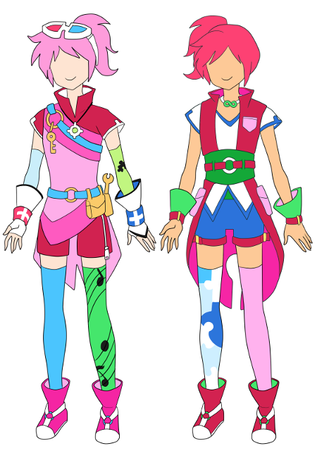
So when you see a character with a visually busy and complex outfit design like Jig (left side)…
…or her brother Tango…
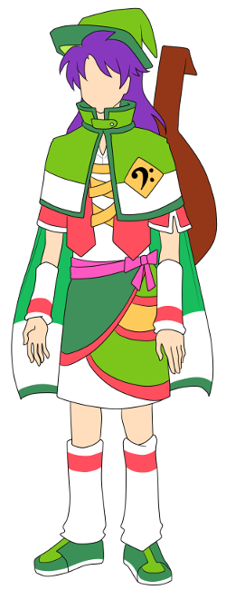
…it’s usually because I had very specific ideas for the gameplay functionality of their clothing. Characters are even balanced partly by their clothes. For example, the Characters page shows over five times as many clothes that boost Magic Power as clothes that boost Power.
An unintended consequence, though, is that I’ve made it more difficult than it should be to convert certain character designs into their 16-bit forms. Jelia turned out well because of Alex’s skill, but nothing guarantees that it’s going to keep up considering some of the designs yet to be pixelized. So that’s something I’m thinking about at this point in time.
Why am I thinking of this? Well, because of my second topic for today…
Pixel Art Monsters
Got a promising application from someone wanting to draw the monsters and other enemies of Dreamblazers! :D Actually, I got this application nearly a month ago and it nearly got lost by not forwarding to my email… so my own blunder nearly blew this opportunity, but now things are looking up. I won’t say anything more until it’s officially official (!), but—well, I’ll just say I’m really hoping on this one. =) And you’ll know the details when I have them!
Pixel Art Cohesion
With a third pixel artist potentially on the way—and knowing that my goal for the monsters is to approximate a Pokémon style—I started thinking about the cohesion of all the pixel art. Right now Becca tends to draw fairly realistic environments (to the extent pixel art can be realistic) while Alex is faithfully recreating Flora’s artwork and color choices in pixel form.
I’m usually constantly pushing toward brighter and brighter colors and so far I’ve been fortunate that nothing seems to blatantly clash, but I began to wonder if that can continue. Will I eventually break everything with the monsters? What about the special effects (like magic)? Will the menus do it?
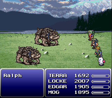
And then I realized something just this past week. Look at this Final Fantasy VI image:
I’ve played thousands of games and I’d have to think about it, but my gut feeling is that Final Fantasy VI is probably still in my top ten of all-time. It’s a masterpiece and always will be in my book.
That said, the more I look at this picture, the more it seems like a visual mess despite each individual element looking very nice. The background clouds, lake, and trees are hyper-detailed to the extent that it wouldn’t surprise me if I found out they took a photograph by a real lake and did their best to trace it with pixels.
The heroes are a colorful animeriffic bunch with the green-haired Terra, Edgar’s pastel blue and green outfit, and Mog the cute fantasy creature, but the enemies use earth tones and darker shades for a more gritty feel. If that wasn’t clashy enough, the menus are a basic blue gradient.
And the perspective is extremely skewed in a way that I can best illustrate visually:
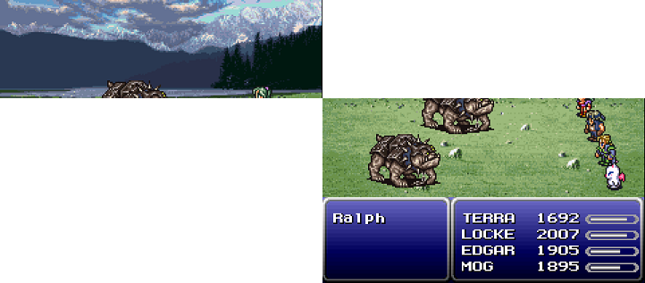
The background is basically a flat-angle shot from the side of that lake, but the rest of the ground is a tilted aerial perspective looking down and forward. Either of those on its own is fine, but put them together and it’s a disjointed effect of two cameras being mashed together.
But—and here’s the key thing—I never noticed any of this until now. I didn’t notice, I didn’t mind, and although I do notice now I still don’t mind. So I’m going to plow forward without concern! Apparently I’d have to mess up super badly for any lack of cohesion to be as big a deal as I’ve made it out to be in my mind and in my worries.
Game development is a pretty fascinating thing, huh?