6. Beastly Screen-filling Sprites
Long before Shadow of the Colossus and Monster Hunter, 2D game developers understood the power of monsters too big to be contained in a TV. After the player grows used to smaller enemies, a large one leaves an impression.
EarthBound proves that enormous enemies don’t even need to look especially threatening:
Developers typically save this technique for late-game bosses, so I won’t ruin the surprise by directly showing some of my favorites, but other examples of capital-sized enemies include Secret of Mana, EarthBound, Chrono Trigger, and Mother 3. The Etrian Odyssey series has also taken this idea to another level, but I’ll reserve that for another day—and a post to itself!
One major series that doesn’t take full advantage is Pokémon. The third and fourth generations of games, Ruby and Sapphire and Diamond and Pearl, had a cool Pokédex feature comparing the height scale of a human with any Pokémon the player had caught to demonstrate how small a Diglett or how large a Wailord is, but during battles, size differences only show in the home console games. In the main portable games, almost every fully-evolved monster looks about the same size as any other, whether it’s the fourteen-foot-tall creator of the oceans or a dancing 4’11” Mexican pineapple duck.


The appearance of a legendary Pokémon could inspire awe if drawn to scale, so this could be considered a missed opportunity. Still, the sale of 215 million games makes it obvious that players already love Pokémon and its artwork to death (and I’m one of them), so maybe leaving well enough alone is for the best. If nothing else, the absence of visible size differences helps convey that most Pokémon can contribute to a victory under the right circumstances.
7. Sprites with Full Wardrobes
Just like learning a second language accentuates the similarities between one form of human communication and the next, an abundance of multiple outfits can highlight a constant character design.
Seeing Kirby in so many hats serves as a reminder of what doesn’t change about him: he’s a cute round ball with huge shoes. Another example is Mega Man changing his color scheme with each new power while retaining his core design.
Alternate outfits become more about the clothes than the character in games like Final Fantasy V, Final Fantasy Tactics, or the Game Boy Advance Tales of the World: Narikiri Dungeon titles because hair style, animations, and sometimes even body size change with a character’s job or class.
Hair color and skin color are typically the only constants in these games. MMORPGs go through this too; gamers sink great amounts of time into character creation only to cover every bit of their heroes’ bodies with flashy gear. In these situations, changing classes or armor might as well be changing the whole character.
Another way to get value out of multiple outfits is doing the opposite of overhauling a hero’s design with every new piece of equipment: give players a one-time choice of character design and make them stick with it. Etrian Odyssey offers two male and two female designs for each character class; Etrian Odyssey III also added a choice of two palettes for each of the four sprites. The commitment of choosing a single design gives a sense of ownership over and attachment to that design. This technique is even more powerful in a game that can last for over a hundred hours.
These are from Nyleveia, linked just above. I’m looking forward to their sprite rips from EOIV; I love choosing my party’s designs and character classes months before the games make it out in English.
8. Combination Sprites
Part of the beauty of Chrono Trigger is that it understood and put into practice a rare principle: when enemies interact not only with the player but with each other, they feel more like vibrant, thinking, living creatures with symbiotic relationships.
This includes monsters who take a cue from the player party and combine their attacks, like Masa and Mune using X-Strike or Reptites knocking around Volcano monsters to make them spew lava, but two-for-one monsters like the Bantam Imp and Roly Rider are my favorite examples for a showing of teamwork along enemy lines. The Dragon Quest series features the Slime Knight, an enemy combo that I hold especially dear even though their teamwork is purely aesthetic.
For a platforming example, Yoshi’s Island features its own bird-and-basic-enemy combination with Goonies who airlift Shyguys and drop them on Yoshi’s head. Shyguys themselves can carry red coins, clouds, or 1-ups around, which was a nifty touch at the time and remains cool today.
Combo sprites can earn bonus points by juxtaposing two opposites. I call it the “Vegeta in a pink shirt” effect. (No, not really.)
Mother 3‘s Ultimate Chimera is a fearsome demon beast with fangs bigger than its legs! …and a cute little chick on top of its head. Mega Man 7 has a memorable opening where Mega Man asks for his helmet and Auto hands him a Metool helmet just for kicks. The small touches of a hero wearing the colors of his enemies or a pinch of sugar on top of a monster make a difference.
9. Deathbringer Sprites
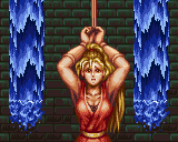
The Moonlight Parade dancer was a goddess of victory, but 2D art can also become ageless by playing the role of the Grim Reaper as seen in any number of Game Over screens. Not all of my favorite examples are sprites, but their takeaway lessons remain.
 Game Over screen.gif)

Some Game Over screens are full background images, such as the arcade Ninja Gaiden, while others straddle the line of background and sprite, such as the Final Fight series. A full-size scene isn’t necessary for memorability, though.
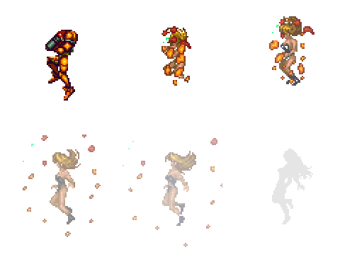
All the way back to the original Street Fighter II, a simple beaten-to-a-pulp face works great. Extra credit given for the fact that these bloodied characters serve as both reward and punishment depending on which player was on the winning side. These examples still use large size and detail to their advantage, but death sprites can work even as miniatures, as in the Metroid series, which came full circle after its first two games. Samus’ appearance was originally reserved for victory conditions under time limits, but after Super Metroid rolled around, her appearance could also symbolize the player’s loss.

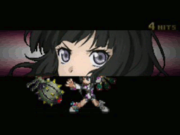
The deathbringer technique doesn’t always coincide with the moment of defeat. The Tales series flashes 2D “cut-in” artwork on the screen just before characters unleash their ultimate attacks, the Mystic Artes. This builds anticipation for the serving of pain to come regardless of whether it’ll be enough to finish the target.

These cut-ins range from small to very large. Neither is inherently better or worse; with the right timing and artwork, simple eye close-ups work as effectively as full body shots.

Combining super attacks with taunts would also deliver, but I’m at a loss to think of any games that tried it out. Usually they’re idle animations or shown only before a battle begins. If taunts have been combined with super attacks before, please let me know where—the closest I can think of is Colette’s cut-in from Tales of Symphonia, pictured above, but it only fits when taken out of context. While she’s not saying “oh please, you’re not even in my league” before bringing down the judgment of the heavens and probably never would, a different character could pull it off. One of Sho Minamimoto’s famous phrases from The World Ends With You is “So zetta slow!”, which he mocks the player with while teleporting away from attacks, but that’s all audio—accompanying artwork can sell a character’s arrogance too.
10. Simple and Adorable Sprites
The Dragon Quest series is loaded with cute monsters. Even the uglier ones have their own charm, which aided DQ greatly when it branched out with the Dragon Quest Monsters spinoff series.
These kinds of monster designs are timeless in their simplicity; it’s difficult to forget what they look like because there’s so little about them to forget. Many Pokémon rely on the same principle.


A King Slime is little more than a crown on a blue circle and a Gengar is a Cheshire Cat smile on a purple blob. They’re about as complex as Kirby, who the intro of Kirby’s Adventure explains how to draw in just a few seconds, yet they’re well-known and well-loved. Even the more involved designs shown here, like the Imp or Lilligant, feature few lines and a lot of solid-shaded body areas. Despite all the thought and thoroughness that one can sink into character design, sometimes simplicity is the best thing going.

Pingback: May the Fear Be With You | Game Design and Deconstruction