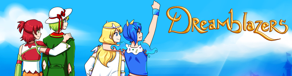
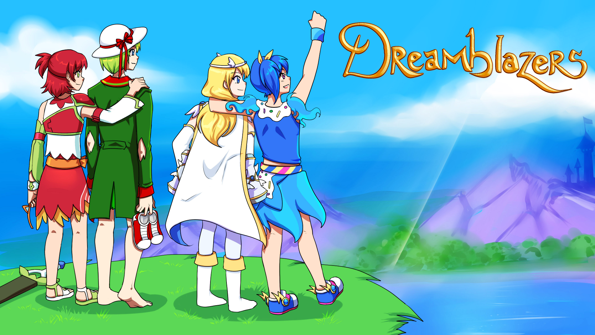
We have ourselves a title screen! Finished mid-week, this was Flora’s final image for me and is about the grandest sendoff I could ask for. =) It’s even thematically appropriate! …but this artwork was always destined to use this concept. Besides the obvious adventure theme, Leaf, Celty, Cotelle, and Minori are who I call the “Big Four” of Dreamblazers, the mainest of main characters—I wanted to emphasize from the very title screen that there’s no “Goku” who dominates the spotlight.
There’s another subtle bit here with the character groupings. In a game about people’s hopes and dreams for the future (and I’m not talking about the story only or even the story primarily; the most important thing to me is that the gameplay is about the player‘s style), characters are bound to have different dreams. Leaf and Celty are united here, as are Cotelle and Minori, but the two pairs don’t share the same vision for what they want to bring to their world, so there’s a slight physical gap between them.
The completion of this picture also means that I’m getting my stuff together and ready for posting in the ORK Showcase section like I mentioned last month, including more fleshed-out character profiles than the previous time, so I’ll finally be fielding a little bit of feedback. =) Flora gave me a positive reception for the colorful and eccentric characters when we first started together and the same is true for Becca, but I did after all hand-pick people whose artwork I liked, so we’ll see if the next rounds of unfiltered feedback are any different. =P
Speaking of Becca, let’s get to the other big front! Here’s a quotation from Flannery O’Connor:
I find that most people know what a story is until they sit down to write one.
I actually do know what a story is—but I found that I knew what pixel art was until I sat down to explain in detail what I wanted. It ate a good lot of time to hunt down references and think through how much is too much or how little is too little. Do I want three frames of animation for water or do I want five? How many types of edges do I need for sand? What small details would give the ground visual variety? Should I go for complete-looking tile sets now so that I can make a more earnest attempt at raising money from other people? On the flip side, given that I don’t know if I’ll be able to raise money or how much, should I do more minimal tile sets now?
In the end, the answer is often “I don’t know, so I’ll just play it by ear.” I refuse to say “this is more art than science,” partially because I don’t care whether video games are art and mostly because I don’t believe there’s any legitimate divide between art and science in the first place, but the idea does stand that there might be no right answer in terms of how to handle pixel art.
Either way, the point is that pixel art is just about underway and I couldn’t be happier with that. ♥ The long run of character design art has concluded, but we’re making like Pokémon: hitting Baton Pass and pursuing another horizon.