Tag Archives: Final Fantasy

Dreamblazers Devlog: Week of May 4, 2015

Pixel Artists

The call to arms is out for pixel artists along with the help wanted page earlier this week! So exciting times are ahead on that front as we’ll see who applies and what comes of it all. Actually, as I type this I already have a handful of applicants, all interesting… one in particular has a very, very nice FFVI-style character.

I’ll give it at least a couple days to fully consider my options, though!

Battling in Style

On the development side, lots of spreadsheet-based insanity over the past week after I discovered that my power scale had gotten out of whack. I didn’t mention this over the past few months because art was more visually interesting to post, but when I explained on the Dreamblazers main page that wearing certain outfit styles will boost stats, I only had that idea as recently as February or March. After all, back in November even I didn’t know the ultimate purpose of the fashion system.

After I implemented the outfit bonuses, though, I hadn’t put them through the ringer of playtesting battles until recently. I was happy with battle balance ten months ago since that was the first thing I did—and with formulas based on Pokémon but on a weakened scale, how could I possibly screw it up just with some minor bonuses? It’s not like Pokémon items such as the Life Orb or Soft Sand fundamentally change the game.

But, well, I screwed it up anyway. =P

The bonuses I gave were just too strong, especially three-style bonuses and barefoot fashions for hand-to-hand combatants (and I have several hand-to-hand combatants because martial arts are for girls).

Regarding barefoot fashions, this was basically the same dilemma that many RPGs face with monks who can use weapons but also don’t need them. If you make their bare hands too powerful then why bother with the option of weapons (Final Fantasy style), but if you make weapons too powerful then why bother with a unique ability to fight with their bare hands (Etrian Odyssey III style)?

Dreamblazers doesn’t have swappable weapons, so I used shoes for a similar effect and wound up with the first option: shoes just weren’t worth wearing. In the end, though, this dilemma was pretty easy to resolve once I saw it in action and did the math.

Regarding three-style bonuses, this was and still is a more complex dilemma about stacking. It’s significantly more difficult to get a girl into three styles than only two, so I wanted a three-style bonus to be noticeably stronger than a two-style bonus… but having a three-style bonus also usually means having three other two-style bonuses.

To illustrate, let’s say you’re a player and you believe there might be three-style bonuses for Dancer+Formal+GirlyGirl or for Cool+Speedy+Sporty. (I’m not going to say whether there are!) While assembling these outfits, you’d also naturally be assembling Dancer+Formal, Dancer+GirlyGirl, Formal+GirlyGirl, Cool+Speedy, Cool+Sporty, and Speedy+Sporty, which could have their own bonuses! So potentially you’re getting up to four total bonuses from a triple combo, not just the one.

I still haven’t quite hit the mark on balancing out this power, so that work continues for now. I want players to explore and to feel rewarded for exploring the outfit system because it’s certainly unlike anything I’ve seen in an RPG, but I do have to keep it from getting out of control.

Veteran Characters

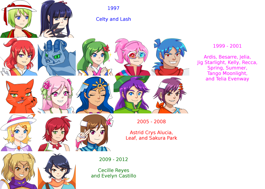
I noticed that these past few weeks of devlogs have been mostly business, so I’ll end with the return of some trivia—in a sense! One thing I appreciated about the most recent Super Smash Bros. was the All-Star mode that grouped characters according to their years of creation to give a sense of history, so I’ll follow suit with my own characters.

Portrait Collection Dates

These are only the characters who have finished dialogue portraits, so each of these groupings of years will expand in the future to include some characters you can see on the Characters page and a few who aren’t visible anywhere yet! =)

(Flora, if you’re reading this: when I look at this I’m reminded to say thank you again, thank you still, and thank you always for teaming up with me and bringing my characters to life. Some of them have been waiting on me for a long, long time! )

Dreamblazers Devlog: Week of March 2, 2015

Let that serve as my introduction to what’s been a whirlwind week of art. :D And it applies not only to characters, but also to pixel art—so first up, because it takes less vertical scrolling, here’s a pixel art preview from Becca!

Ah, look at those lovelies! ♥

This is her mockup, not the actual in-game layout of one of the early areas—I need to convert my placeholders to this real tileset, with colliders and all—but it’s a good thing she made it since I see a couple ideas here that I wouldn’t have realized were possible just from looking at the tiles.

This tileset is for the first cave the player will enter (no matter how “out-of-order” they take the first continent, there aren’t any other caves to enter first), so the friendly and warm feel of the color palette sets the tone for the rest of the game. All the beach-related tiles will also show up later on the second continent, the Grand Isle of Lumina—but let’s not get ahead of ourselves. ;P

The inspiration for the rock walls comes mainly from Final Fantasy VI, including the fact that they come in a different color not shown here that will be used for other caves, while the shallow water layer on the floor was inspired by a few areas of Chrono Trigger. That layer animates, as does the deep water on the lower left. The inhabitants are pretty adorable, so there are also some cutesy objects around their living quarters!

The next tileset will be the overworld and I’m gathering the remaining references for those today. =)

Next up: tons of new faces from Flora!

Portrait Collection 8

Today’s notes:

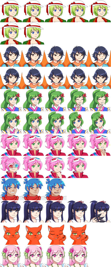
* When I have a big enough audience, I’d really love to play a game of “Guess Which Of These Characters You Don’t Fight” with this image. =P Top to bottom are Celty, Evelyn Castillo, Jelia, Jig Starlight, Kelly, Lash, Recca, and Spring.

* Compared to last week’s selection of Ardis, Astrid Crys Alucia, Besarre, and Leaf, these characters have fewer expressions each. This is partly because of their personalities or roles in the story, but also because sometimes I realize only after seeing the exact number of expressions that I asked for that I do need more than expected. Look for almost all of these characters to get 1 or 2 more faces in the coming weeks. Incidentally, the number of faces per character (and especially the current number) doesn’t say much about their story importance; nobody has more screen time than Celty or Recca.

* Random trivia time about Jelia! Her original name in my 2000-2001 documents was Jelly, but that obviously couldn’t stand since Jelly’s now the name of my mascot. Her original incarnation was significantly more colorful, if you can believe that, but even on paper it looked like a pretty disgusting level of non-coordination. =P

* Random trivia time about Jig! She and her brother Tango were always going to have musical names, but going through different music-related terms was quite an ordeal. A lot of the good names were taken by Mega Man—in fact, as I would realize only later, the name Tango was one of them.

My original idea was Twist and Tango, the T&T twins. For an inventor like Jig, Twist would have been an interesting name that carried a musical connotation while also implying things like twisting wrenches or turning gears. They would also both be named for dances, just as they are now. Only problem? My Little Pony ruined that for me with a Twist who’s more of a geeky character—the antithesis of Jig. Running through all the names of dances, Jig stood out as a pretty upbeat name that could also be taken as part of a jigsaw puzzle, a fact that Flora picked up on without my even mentioning it since puzzle pieces ended up in her design.

* Random trivia time about Lash! Along with Celty and one other as-of-yet-unrevealed (and undesigned!) character, Lash is one of my oldest surviving characters harkening way back to 1997. Many of my other characters back then were pretty dubious in quality, not to mention being ripoffs of whatever I was playing and watching at the time, but Lash has endured.

Dreamblazers Devlog: Week of February 2, 2015 (Existential Crisis Edition)

I could talk about many different things this week, but one stands above the rest. During the pixel art reference gathering process, I was comparing Final Fantasy VI, Chrono Trigger, and a bit of Lufia II and somehow reached an existential crisis.

I had always envisioned that Dreamblazers would resemble FFVI but with a Pokémon-esque color palette to kick up the appeal. For me there’s always been a certain charm to obviously grid-based pixel art like in FFVI and Lufia II. I also believe that it serves the gameplay; I remember when Pokémon Black and White finally created the illusion of a “broken” grid and I suddenly had occasional trouble judging whether a strip of water-to-ground edge tiles could be walked across or were merely there for visual credibility.

Grid-based pixel art, though arguably worse in terms of visual appeal (but only arguably), does come with precision for an intuitive feel.

Up until now, every decision I’ve made has been firmly in the interest of gameplay with no regard to anything else. That would make it obvious that I should stick with the grid.

Only one problem: one thing is even more crucial than gameplay and that’s financial viability. With all my tax stuff coming in week by week recently, I took stock of my spending and found that I’d put nearly $5,000 into Dreamblazers in 2014. And this isn’t even counting the hidden opportunity costs of having no part-time job, no contract work, and absolutely nothing else except a tenant in a rental house.

This isn’t worrying in and of itself—and by that I mean I freaked out for a couple of days and wondered if I was the craziest idiot on the planet. How could a game that I intend to sell for $15 or less (probably less) recoup all the money I’ve sunk in, never mind the pixel art costs that I’m about to run into?

…but then I consulted my spreadsheets. Years ago I crunched the numbers of Kickstarter projects that I’ve backed and I’m still crunching them today. After taking away outliers that skewed the numbers upward like insane media hype, known franchises, famous developers, re-releases, and multiple games in one project, taking away outliers that skewed the numbers downward like very small-scale projects that raised $2000 or less, and taking away successful things that were game-related but weren’t games, the average Kickstarter project I back raises $64,317.78. That might seem a bit high, so if I factor out all six-figure success stories and all four-figure success stories, that still yields an average of $32,985.99—more than enough to justify everything I’m doing.

Ah. Relief!

That figure is only the average, though. In my ideal world I’m better than average, but the worst-case scenario is missing even the average mark. So what would make me more likely to be considered above average? What make me less likely to be considered below average? These were the questions that faced me while I had a picture of the FFVI overworld and the CT overworld open next to each other.

Philosophically speaking, it’s not true that perception is reality. In fact, one way of defining reality is that which is true regardless of whether anyone perceives it—but that’s philosophy. In the world of economics, perception is consumer behavior and consumer behavior is reality.

I’ve watched more than enough indie RPG projects to know that obvious-grid pixel art tends to draw criticism about an RPG Maker look—and that’s the “reality” even if the game is made with Unity, Cocos2D, Moai, anything else out there, or just created from scratch in C++. There’s also a pretty big glut of C-level 16-bit-style RPGs flooding mobile devices, which is another type of “guilt by association” that I don’t want to deal with.

So there I sat, pondering whether I should trust my gameplay preference as I always have or whether this was the one situation where I had to draw a line and make a call about what tiles should and shouldn’t look like for financial reasons.

And you know what the answer is?

I’m now leaning toward the Chrono Trigger style, but ultimately I’ll wait for one tile set (or at least some sample tiles) and go from there. I need to judge as I go—because the target audience is me. The target audience is people with tastes similar to mine, AKA the people who back the same Kickstarter projects that I back and provide all the numbers that I’ve been using for my assumptions in the first place.

Shockingly enough, I might just for this once be a great judge of how to progress with my own life.

Dreamblazers Devlog: Week of January 12, 2015

This is what we call an ideal past week. :D

* I went back to the basics and watched many Unity tutorials—something I should have done months ago, frankly—and picked up multiple new ideas for handling things more effectively.
* Because I went back to the basics, the camera works now!
* The collisions work better than they did before (and I figured this one out myself). Because my placeholder sprite was larger than the other sprites around it (in the vein that Final Fantasy VI‘s sprites are slightly taller than a tile), my character was occasionally being pushed around to coordinates like 15, 12.034 instead of even integers. Got that taken care of.
* I finally resolved my earlier computer issue for real this time so it doesn’t happen at all. =)
* And, totally unrelated to Dreamblazers, after three months of SolForge ladder tournaments I finally won one!

Yep. A great week!

So two core parts of the game are now functional: RPG gameplay mechanics (battle system, stats system, etc.) and most of the 2D physics. However, so far I built each component in a vacuum: the RPG gameplay operates in a 3D setting and the 2D physics operate without any of the RPG elements. Now I need to put them together and hope nothing breaks.

I’ll also be concurrently searching for pixel artists. In July 2014 I told myself that I aimed for a playable demo within a year. So far I can’t tell if I’m going to make that goal or not, but in order to have any chance, the pixel art ball has to get rolling immediately. Environments, characters, menus: the whole works.

Dreamblazers Devlog: Week of December 8, 2014

Last week’s achievements

* Sent art feedback for final Winter design
* Started art feedback for final Jig design
* Sent title screen image requirements
* Designed initial layouts for Seaside Slime Cove, Den of Kobolds and the Unicorn

Current focus

Final art run (for now) and touching up various features.

Sample stuff

Winter character design

Here in time for Christmas, it’s Winter, the most cheerful and eccentric of the seasonal seraphic sisters! One of the major goals of the story is to meet all four.

Weekly goals

* Integrate animations with ORK
* Make the 2D camera follow the player
* Design layouts for Spring Lake Valley and Winny Spring (and clean up the existing ones as needed)
* Write bestiary flavor text for remaining enemies

Comments

Sudden art burst from nowhere! Jig’s (non-alternate outfit) design is pretty much finished except for her color scheme, which means I’ve spent and will continue spending hours of fill tool fun to figure this out. She’s a very colorful dresser like Jelia, who also took a good long while, so making a balance that doesn’t clash but also expresses her personality is difficult. More importantly, Jig is the final character remaining with Flora, so it’s kind of bittersweet, but… that’s it! Nothing more after this. (At least not for purposes of a playable prototype.)

Other surprises: family visit from nowhere! I knew they were traveling all over the state visiting other relatives, but didn’t know it was in the plans for them to come see me for a few days.

Lastly, on the subject of map-making: I feel way too uneasy when designing dungeon maps and I’m going to continue tweaking them. The overworld is a different case. I simply design surprising locations like an elevated crater lake, a desert on a tropical island (hey, Hawaii has one), and a place where rivers, lakes, and the ocean all border. More importantly, each overworld continent is meant to be a self-contained area that people can travel as they please with no right or wrong directions because all of them are progress (even if nothing else is available to do yet, they add 0-EP teleport locations), so designing it is pretty stress-free.

But when I narrow the focus, a single cave or forest has an end goal in mind and has to properly but subtly lead the player. Nothing has warped my opinion and triggered my perfectionism here quite like the Sequelitis Mega Man X vs. Mega Man Classic video: there is such a thing as a correct way to do this!

In most RPGs you could simply design many false roads with treasure at the end, but in a game where the only items are equipment and all equipment is viable from start to finish*, that becomes a tougher balancing act.

Simply making circular paths that ultimately lead in the same direction isn’t an option either since those can be annoying to players, who wonder if they’ve missed something and wind up treading the same ground three times (forward, back, and forward on the other fork).

We’ll get there, though! This is 1) a gameplay element and 2) an element I’m making myself (as opposed to music or pixel art, etc.), so I definitely pride myself on getting it right.

( * Equipment for me is comparable to skill systems in Final Fantasy IX or Bravely Default: not all equipment will be useful for all situations, but all equipment is useful in some situation, so you’re building a collection of swappable “skills” via clothing.)